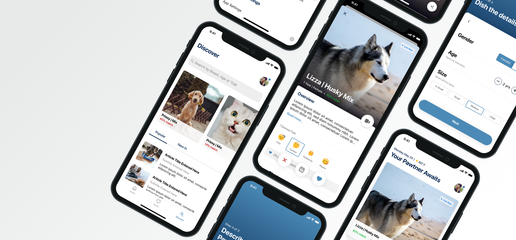
Pawtner Pet Adoption App Concept
Blog / Pawtner Pet Adoption
Pawtner Pet Adoption App | Concept
Exploring ways to make it easier to find your life Pawtner, through mobile pet adoption.
Why
The problem:
Faced with an overflow of abandoned pets, and an extreme lack of resources to find every pet a forever home, there was a need for innovative solutions to encourage pet adoption.
💡 6–8 million animals end up in shelters each year, half of which will
probably not be adopted.
-The Humane Society of the United States | HumaneSociety.org
The goal:
With these pain points in mind, our goal was to expand reach, encourage and simplify the journey of adopting a furry friend.
This is a conceptual project produced in partnership with a volunteer from the Humane Society of Northeast Arkansas.
Who We’re Design For
Eco-Conscious
People who have an extra interest in the adopt don't shop mentality.
True Companion Seekers
People who value the bond of pet adoption. Just any pet won’t do. They want a good match for their lifestyle & preferences.
User Story
Meet Brittany
Brittany is a young, successful copywriter for a fast-paced ad agency. She doesn't have a lot of space in her downtown apartment but she rarely spends time indoors anyway. When she's not taking long walks through the downtown community, she enjoys outdoor activities & spontaneous road trips. She’s hoping to find a furry companion that will be happy to share in her wanderlust. Pet adoption is new for her but has heard great things from her coworkers about the priceless bond.
Needs
An on the go tool that can help her locate & keep track of available pets.
Help to find a pet to match her personality & lifestyle.
A support system to help her learn how to best care for her adopted pet.
Frustrations
The animal shelters are too far from her home for her to check regularly
The websites available are hard to navigate
She doesn't know much about breeds & personality types
Research & Competitive Analysis
As much as we'd like to say we were original in our idea to digitize the adoption process into a mobile application, we weren't. So of course we had to scope out the competition. One great thing about not being the 1st in the market, you can learn from others wins & shortcomings (Even if it takes a few tries 😉).
Key Findings:
Options for easy pet adoption are limited. We came across many apps & websites that offer the ability for users to search adoption databases but found that many of them lacked in key areas: usability, navigation & personalization.
Many of the other application’s architecture & navigation structures were complex and difficult to parse. Actions often led the user out of the app to a web view.
Most leaned on the side complexity for the sake of filler content. Lots of rabbit holes that lead the user away from the original goal.
Personalization or sorting was offset to very robust filtering options but once the user closed the application all of those settings were lost.
Little bit of this, little bit of that, none of that, this was the beginning of what we hoped would be a winning recipe. It was during this process that we likened the experience of adopting a pet to finding a mate and thus was born the concept, the dating app...to find a pet....a furry friend....a pawwtner😆.
Feature Definition
Of course, all of the research got our brains overly stimulated. The ideas came in abundance and we found ourselves with a pile of potential features and directions.
Truth: in Round 1 of our concept this was our demise, we shot for the moon and missed by a mile. Here lies the beauty of growth via iterations:
Round 2 = Priorities
After a 2 year break, some self-reflection & a little more research, we learned the error of our ways. Using our user journey as a guiding star, we put on our adulting pants and reigned in the wish list. The goal: defining a realistic MVP without sacrificing the usability or quality of our product.
Execution: Design
With round 2 of the feature set came round 2 of design and this time with purpose. Pet adoption isn't just about the process, it's a decision between head & heart. Our experience should encompass that, so we took another go at it with these 3 principles in mind:
☝️Essential
Everything they need and nothing that they don't, lose all the fluff & puff. Every element & decision should contribute to the experience.
✌️Conversational
Not just user-centered, but human centered. The product should have life, capture the passion & care of the societies volunteers. We know pet adoption can be daunting, time-consuming & complicated, let's walk them through it.
👌 Inclusive
Good design is design for everyone, our product should invite & cater to users just as diverse as our pets.
Reflection
This project over the years has become one of my favorites (which is surprising because it was also one of my first) I keep it around, not because its ground breaking or super cool but because it acts as a marker for my personal development. Though it remains just a concept, the process & the iterations have contributed so much.
Oh, the joys of learning & growth.🌿
It's taught me the importance of going beyond aesthetics, thinking critically & designing experiences with purpose, for people. A lesson I actively work to carry into every product I touch.
Thanks for reading! See you in a year or two for round 3 (Maybe 😉).


